Borrowing UX from typing tests
The browser typing tests that people use to measure and practice their typing have been refining a single idea for a long time now: how do you show a block of text to a human and let them hammer on it comfortably. A lot of iteration, a lot of user feedback, a lot of small decisions that have settled into the defaults you now see everywhere.
I leaned on that work directly. Keeb Quest is a game first, but the moment you’re typing, you’re inside a UI that lives in the same family as any serious typing test. So the interface learned from what those sites already figured out. Cursor styles, caret movement, word coloring, stat reporting, the post-run graph. Those already had standard answers, and I adapted them instead of pretending they needed to be invented from scratch.
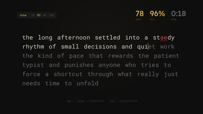
#Cursor styles: line, box, underline, none
The first thing I borrowed was the cursor style picker. Typing test users are opinionated about their cursor. Some people lock in better with a vertical line. Some need a box around the active character for spatial certainty. Some prefer an underline that stays out of their peripheral vision. Some don’t want any cursor at all and just follow the color transition as letters resolve.
My first implementation had only a box cursor. After a couple of sessions I realized that was the wrong default. The box obscures the active letter slightly, which is fine when you’re new but annoying once you’re fast. The vertical line is what most typing-test users are used to, so I switched the default over and added the other variants people actually ask for: the box (for anyone who does want that spatial certainty), a thin underline (always visible, stays out of your way), and nothing at all (you type by muscle memory and watch letters resolve green as you pass them).
Tiny feature. Made a real difference to how the game felt to me once I could pick. The “weird-feeling” thing I kept noticing with the original box cursor just went away once I switched to a line.
#Caret speed: how the cursor glides
Related but separate: how fast the cursor slides from one character to the next. It comes in four speeds: off, slow, medium, fast.
The difference between off and on is more important than it sounds. When the caret snaps instantly between character positions, there’s no visual trail connecting your last keystroke to your next one. When it glides, your eye can follow the motion and predict where the next letter will fall. Slow gliding feels like the cursor is dragging behind your fingers. Fast gliding feels like it’s pulling ahead of them. Medium is where most people end up.
I shipped all four because I kept flipping between them while tuning and couldn’t settle on one. It costs almost nothing to support all of them. If I’d shipped only one as the default, I probably would have regretted it within a week.
#Word color themes
There’s a pattern across every typing UI that’s almost universal: characters you haven’t typed yet are one color (usually gray or white), characters you’ve typed correctly transition to another color (green or white), and characters you’ve typed wrong flash a different color (red). Your eye can scan a word mid-type and instantly know where it is in the word.
I ended up with four themes. The default uses the classic gray-to-green transition with Keeb Quest’s gold accent standing in for the brighter green you see on most typing tests. A softer theme drops the contrast, going gray to white instead, which is closer to what a lot of tests use out of the box. There’s an inverted version where untyped letters are the loud ones and completed letters fade to gray. Unusual, but some people prefer that directionality. And there’s a green-on-black terminal look where everything is phosphor green and completed characters just brighten.
None of this affects gameplay. It’s purely for the player. But having the option to pick the one that looks right to you matters more than I expected when I first sat down to add it. The inverted one is the theme I tried on a whim late one night and now I can’t play the game on anything else.
#WPM samples, and the 5-character word
Here’s the part where I had to read up on how other people do it. I had a vague idea of how WPM worked (words per minute, presumably literal words) but the standard formula is not that. The standard, which every serious typing test uses, goes like this: take the number of characters you typed correctly, divide by five, then divide by the number of minutes you’ve been typing.
Every five characters counts as one “word,” regardless of what those five characters actually are. It’s a convention that lets typing tests score you across any text without worrying about actual word boundaries. A five-letter word is worth exactly one. A ten-letter word is worth two. A three-letter word is a little more than half.
Alongside “net WPM” (correct characters only), most tests also show “raw WPM” which counts everything you typed, including typos. The ratio of the two is your accuracy. Miss nothing and net equals raw. Miss a lot and net drops below raw.
I sample WPM on every word completion. Each sample records four things: the current WPM, current accuracy, what level the player was on, and the elapsed time. Those samples get pushed into an array that lives with the run. When the run ends, I hand the array off to the graph-drawing code.
#The game over graph
The game-over screen in Keeb Quest draws a WPM-over-time chart using the sample array. This was directly inspired by the results pages on typing-test sites, where your WPM is plotted as a line across the duration of the test, with error markers underneath.
I use the same layout. Horizontal axis is time. Vertical axis is WPM. The line shows how your speed rose and fell through the run. A second, dimmer line shows raw WPM so you can see where errors cost you. Boss fights get marked with a small vertical tick so you can see which deaths happened in regular rounds and which happened during a boss.
This was the feature I wanted most myself. After dying, I kept wanting to see when I’d been fast and when I’d slipped. Anyone who’s taken a typing test knows the feeling of watching the graph zigzag across the results page. Leaving it out wasn’t an option.
#Stat reporting
The game-over screen reports the standard typing test stats alongside the battle ones. Final WPM (net, using the 5-character formula) is what most people think of as their score. Raw WPM sits next to it so you can see what you were typing at including mistakes, and accuracy is just correct over total. Alongside those, the same screen shows level reached, score, combo high, enemies defeated, and boss clears. The two sets of numbers sit next to each other. You can read the screen as “how’s my typing” or as “how did my run go,” and both readings work from the same data.
#The point of borrowing
If you make a typing game, you’re going to be compared to typing-test sites whether you want to be or not. Anyone who types seriously is going to open Keeb Quest with muscle memory from thousands of minutes of practice in a different UI. If the cursor behaves strangely, or the colors don’t line up with what they’re used to, or a stat they expect is missing, that’s friction that has nothing to do with the game.
None of the features above are mine. They’re the patterns this little sub-genre settled on years ago, refined by people who know far more about typing UX than I do. I used them because I didn’t want the typing UI to be a thing players had to relearn. The game part is already new; the typing part should feel like home.